
Draw a shape
Choose a shape from the shape-tool group, set its fill and stroke, then drag on the canvas. Select the resulting layer to refine its properties. Use Custom Shape for a preset silhouette and Path Selection or Direct Selection when working with vector paths and points.
A shape fill colors its interior; a stroke outlines its boundary. A path can exist without visible paint. If a path seems to disappear, check whether you created a path rather than a filled shape, and whether the fill or stroke is transparent.
Create a gradient above the selected layer
- Select the layer that should sit immediately below the new gradient.
- Choose the Gradient Tool and drag from the desired start to end position.
- Inspect the new gradient fill layer and its mask in Layers.
- Use the gradient controls to change its style, colors, opacity stops and transition.
- Adjust layer opacity or blend mode to combine the gradient with the image beneath it.
For a photograph with text above it, select the photograph before creating the fill. Keep the gradient beneath the text if you want the type to stay unaffected.
Color stops and opacity stops
Before drawing, click the gradient swatch in the top toolbar. Search by name or expand a color folder, then choose a preset. Use the five shape buttons to select Linear, Radial, Angle, Reflected or Diamond. Click outside the picker or press Escape to close it. These toolbar settings affect your next draw; use Properties to change the selected fill.
The Method menu changes how colors blend: Classic preserves the original RGB blend; Linear mixes light for brighter transitions; Perceptual blends in Oklab; Smooth eases the transitions at each stop; Stripes makes hard color bands. Try them in Properties and use Undo to compare. Shape and Method are independent: a Linear shape can use any method.
Color stops determine which colors appear along the gradient. Opacity stops determine transparency. Moving a stop changes where its value occurs; a midpoint changes how the transition is distributed between stops. Layer opacity affects the entire gradient after these controls.
Manage gradient library opens the existing controls for saving your own presets, favorites and importing libraries. PhotoBlaze projects preserve every method. Non-Classic gradients export rendered pixels plus PhotoBlaze editing metadata in PSD: they reopen editable in PhotoBlaze, but other editors may show them as pixels rather than native gradient fills. PhotoBlaze methods are not guaranteed to match Photoshop pixel for pixel.
Linear creates a directional transition; radial expands outward; angle rotates around a center; reflected mirrors the transition; diamond expands in a diamond shape. Reverse exchanges the direction. Dither can reduce visible banding, but cannot restore missing source detail.
Make a simple label behind your headline
- Select the photo layer. Choose Rectangle from the shape-tool group, then drag a rectangle behind the intended headline area.
- Select the shape layer and choose its fill color in Properties. Fill colors the inside; stroke adds a border. Remove or reduce a stroke you do not need.
- In Layers, keep the rectangle above the photo and below the text. Use layer opacity to make it partially transparent.
- Choose Move to resize or position it. Inspect the text at the final display size and keep enough padding around the words.
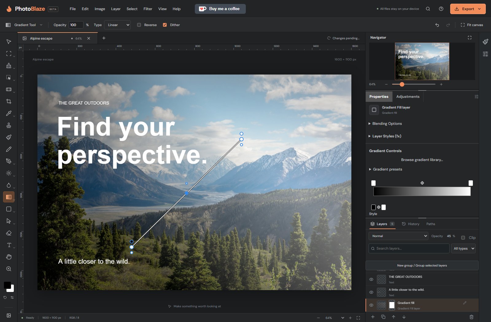
Build a gentle fade instead of covering the entire photo
Start by selecting the photo, then draw a gradient. Its start and end positions set the direction and length of the transition. A short drag creates a quick transition; a long drag spreads it out.
For a dark fade behind text, use a dark color at one end and reduce opacity at the other end. A white color stop is white paint, not transparency. Use an opacity stop when you want the underlying photo to show completely. Reduce the layer opacity if the whole effect is too strong.
If the headline becomes faded too, move the gradient below the text. If the wrong color appears, check the color stops and foreground/background swatches. The default foreground is black and the default background is white; D resets them.